---
title: User interface customization
description: "\"Shows how to customize the user interface (UI) components provided with the PingOne Recognize Web SDK.\""
component: recognize
page_id: recognize:web-sdk:web-sdk-reference-customization
canonical_url: https://docs.pingidentity.com/recognize/web-sdk/web-sdk-reference-customization.html
llms_txt: https://docs.pingidentity.com/recognize/llms.txt
docs_for_agents: https://developer.pingidentity.com/build-with-ai/docs-for-agents.md
section_ids:
customizing-user-interface-elements: Customizing user interface elements
interface-structure: Interface structure
default-style-values: Default style values
example-setting-colors: "Example: Setting colors"
slots: Slots
example-changing-the-spinner: "Example: Changing the spinner"
example-retry-when-liveness-fails: "Example: Retry when liveness fails"
---
# User interface customization
You can use the Web SDK to customize the appearance of PingOne Recognize user interface (UI) components by setting property values.
## Customizing user interface elements
Update the `theme-options` or `themeOptions` attributes with an object using the following structure:
> **Collapse: Details**
>
> ```javascript
> interface ThemeOptions {
> colors: {
> dark: {
> primary: string
> onPrimary: string
> secondary: string
> onSecondary: string
> secondaryContainer: string
> onSecondaryContainer: string
> surface: string
> onSurface: string
> surfaceVariant: string
> onSurfaceVariant: string
> }
> light: {
> primary: string
> onPrimary: string
> secondary: string
> onSecondary: string
> secondaryContainer: string
> onSecondaryContainer: string
> surface: string
> onSurface: string
> surfaceVariant: string
> onSurfaceVariant: string
> }
> }
> elements: {
> button: {
> host: {
> borderRadius: string
> fontSize: string
> fontWeight: string
> padding: string
> }
> size: {
> small: {
> host: {
> fontSize: string
> padding: string
> }
> }
> }
> variant: {
> text: {
> host: {
> borderBottom: string
> hover: {
> opacity: string
> }
> }
> }
> }
> }
> camera: {
> host: {
> after: {
> background: string
> height: string
> }
> before: {
> background: string
> height: string
> }
> }
> }
> cameraCorners: {
> svg: {
> strokeWidth: string
> }
> }
> cameraInstructions: {
> host: {
> gap: string
> }
> li: {
> borderRadius: string
> gap: string
> padding: string
> }
> liText: {
> fontSize: string
> }
> }
> cameraSelect: {
> labels: {
> gap: string
> padding: string
> }
> labelsHeadline: {
> fontSize: string
> fontWeight: string
> }
> labelsText: {
> fontSize: string
> fontWeight: string
> }
> list: {
> borderRadius: string
> margin: string
> padding: string
> top: string
> }
> option: {
> borderRadius: string
> marginTop: string
> padding: string
> }
> }
> dialog: {
> host: {
> border: string
> borderRadius: string
> boxShadow: string
> }
> }
> poweredBy: {
> host: {
> gap: string
> height: string
> }
> icon: {
> height: string
> width: string
> }
> span: {
> fontSize: string
> fontWeight: string
> letterSpacing: string
> }
> }
> qrcode: {
> host: {
> borderRadius: string
> padding: string
> }
> }
> root: {
> buttonCameraSelect: {
> right: string
> top: string
> }
> buttonCancel: {
> left: string
> top: string
> }
> buttonClose: {
> left: string
> top: string
> }
> buttonFlash: {
> right: string
> top: string
> }
> buttonPin: {
> height: string
> width: string
> }
> buttonsSwitchToMobileChoice: {
> gap: string
> }
> cameraBiometric: {
> width: string
> }
> cameraTip: {
> backdropFilter: string
> borderRadius: string
> fontSize: string
> fontWeight: string
> height: string
> padding: string
> top: string
> }
> headline: {
> fontSize: string
> fontWeight: string
> marginTop: string
> }
> host: {
> borderRadius: string
> gap: string
> padding: string
> }
> poweredBy: {
> bottom: string
> }
> text: {
> fontSize: string
> fontWeight: string
> }
> texts: {
> gap: string
> }
> }
> }
> }
> ```
### Interface structure
The theme options structure includes two main properties, `colors` and `elements`.
The `colors` block supports dark mode settings by providing `dark` and `light` objects, which each define color settings for the corresponding display mode.
The following diagram shows how each sub-property applies to the user interface.
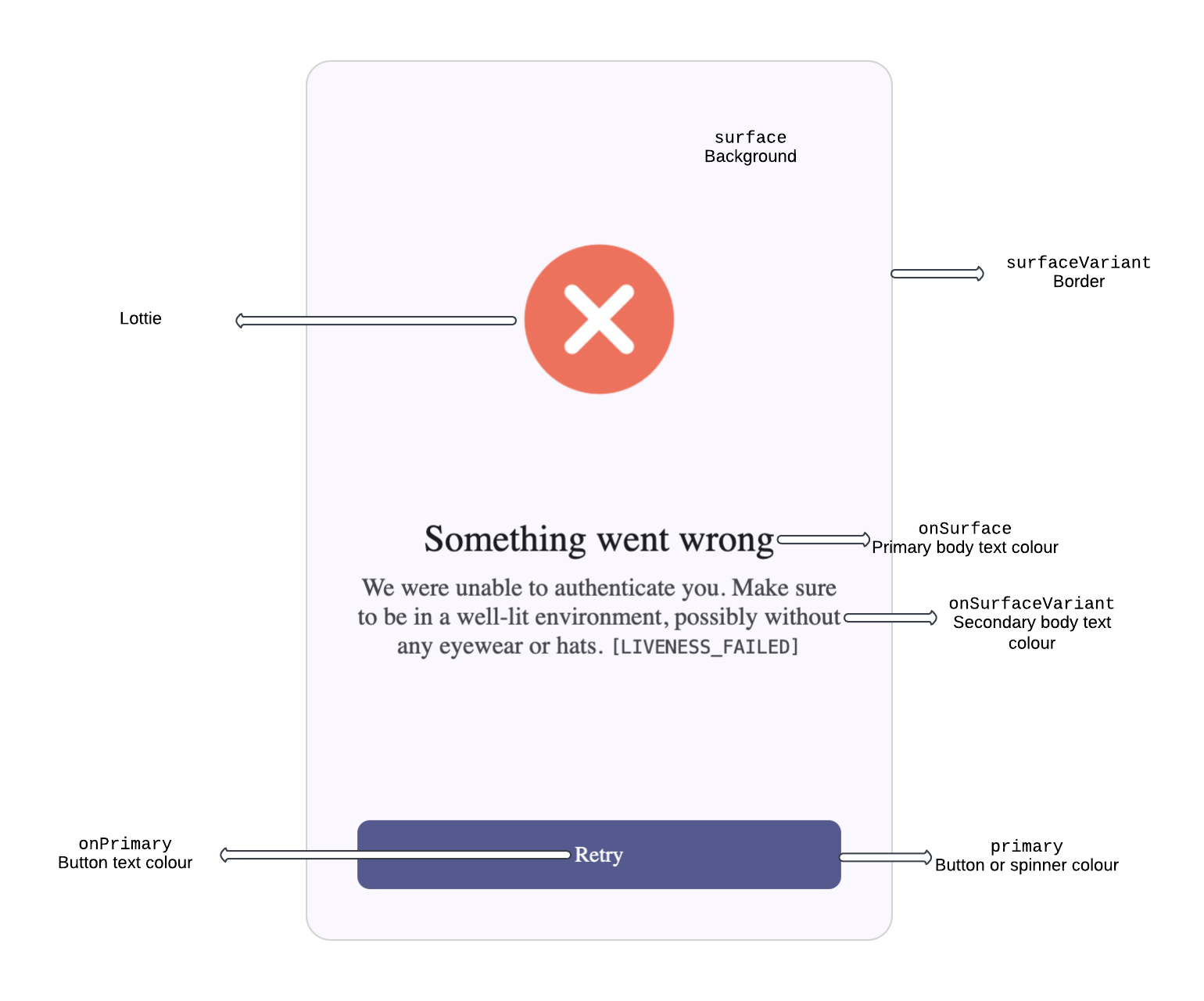
The properties of the `elements` object affect the corresponding UI elements. Each property corresponds to a specific user interface element except for the `ae` property, which refers to the abstraction layer behind the authentication (`a`) and enroll (`e`) operations.
Style changes applied to an element property affect the corresponding user interface element.
### Default style values
The following example shows the default style values for PingOne Recognize:
> **Collapse: Details**
>
> ```javascript
> {
> colors: {
> dark: {
> primary: '#1833B8',
> onPrimary: '#FFFFFF',
> secondary: '#FFD900',
> onSecondary: '#1A1A1A',
> error: '#BA3B1B',
> secondaryContainer: '#2B2B2B',
> onSecondaryContainer: '#F8F8F8',
> surface: '#14161C',
> onSurface: '#F8F8F8',
> surfaceVariant: '#2B2B2B',
> onSurfaceVariant: '#808080'
> },
> light: {
> primary: '#151E74',
> onPrimary: '#FFFFFF',
> secondary: '#FFDE33',
> onSecondary: '#1A1A1A',
> error: '#BA3B1B',
> secondaryContainer: '#F5F5F5',
> onSecondaryContainer: '#1A1A1A',
> surface: '#FFFFFF',
> onSurface: '#1A1A1A',
> surfaceVariant: '#F5F5F5',
> onSurfaceVariant: '#808080'
> }
> },
> elements: {
> button: {
> host: {
> borderRadius: '8px',
> fontSize: '14px',
> fontWeight: '500',
> padding: '14px 16px'
> },
> size: {
> small: {
> host: {
> fontSize: '12px',
> padding: '6px 8px'
> }
> }
> },
> variant: {
> text: {
> host: {
> borderBottom: '1px solid',
> hover: {
> opacity: '0.1'
> }
> }
> }
> }
> },
> camera: {
> host: {
> after: {
> background: 'linear-gradient(0deg, rgba(0, 0, 0, 0.25) 0%, rgba(0, 0, 0, 0) 100%)',
> height: '25%'
> },
> before: {
> background: 'linear-gradient(180deg, rgba(0, 0, 0, 0.25) 0%, rgba(0, 0, 0, 0) 100%)',
> height: '25%'
> }
> }
> },
> cameraCorners: {
> svg: {
> strokeWidth: '3px'
> }
> },
> cameraInstructions: {
> host: {
> gap: '8px'
> },
> li: {
> borderRadius: '8px',
> gap: '16px',
> padding: '16px'
> },
> liText: {
> fontSize: '14px'
> }
> },
> cameraSelect: {
> labels: {
> gap: '12px',
> padding: '24px 0 calc(24px - 8px) 0'
> },
> labelsHeadline: {
> fontSize: '24px',
> fontWeight: '500'
> },
> labelsText: {
> fontSize: '16px',
> fontWeight: '500'
> },
> list: {
> borderRadius: '16px',
> margin: '16px',
> padding: '16px',
> top: '32px !important'
> },
> option: {
> borderRadius: '8px',
> marginTop: '8px',
> padding: '20px 16px'
> }
> },
> dialog: {
> host: {
> border: '1px solid',
> borderRadius: '16px',
> boxShadow: '0px 4px 16px rgba(0, 0, 0, 0.25)'
> }
> },
> poweredBy: {
> host: {
> gap: '6px',
> height: '12px'
> },
> icon: {
> height: '7px',
> width: '55px'
> },
> span: {
> fontSize: '9px',
> fontWeight: '500',
> letterSpacing: '2px'
> }
> },
> qrcode: {
> host: {
> borderRadius: '8px',
> padding: '4px'
> }
> },
> root: {
> buttonCameraSelect: {
> right: 'calc(16px + 18px + 16px)',
> top: '18px'
> },
> buttonCancel: {
> left: '16px',
> top: '16px'
> },
> buttonClose: {
> left: '16px',
> top: '16px'
> },
> buttonFlash: {
> right: '18px',
> top: '18px'
> },
> buttonPin: {
> height: '16px',
> width: '16px'
> },
> buttonsSwitchToMobileChoice: {
> gap: '4px'
> },
> cameraBiometric: {
> width: '100%'
> },
> cameraTip: {
> backdropFilter: 'blur(4px)',
> borderRadius: '4px',
> fontSize: '12px',
> fontWeight: '500',
> height: '24px',
> padding: '0px 8px',
> top: '14px'
> },
> headline: {
> fontSize: '24px',
> fontWeight: '600',
> marginTop: '32px'
> },
> host: {
> borderRadius: '16px',
> gap: '32px',
> padding: '16px 16px 28px 16px'
> },
> poweredBy: {
> bottom: '8px'
> },
> text: {
> fontSize: '16px',
> fontWeight: '400'
> },
> texts: {
> gap: '8px'
> }
> }
> }
> }
> ```
## Example: Setting colors
The following example shows how to change the primary and secondary colors by updating the `themeOptions` property of the PingOne Recognize authorization object (`auth`):
> **Collapse: Details**
>
> ```javascript
>
>
>
>
>
> Auth
>
>
>
> customer="CUSTOMER_NAME"
> enable-camera-instructions
> key="IMAGE_ENCRYPTION_PUBLIC_KEY"
> key-id="IMAGE_ENCRYPTION_KEY_ID"
> lang="en"
> size="375"
> theme="light"
> transaction-data='DATA_FROM_CUSTOMER_SERVER_TO_BE_SIGNED'
> username="USERNAME"
> ws-url="KEYLESS_AUTHENTICATION_SERVICE_URL"
> >
>
>
>
>
> ```
## Slots
The PingOne Recognize Web SDK uses `` elements to customize the following components:
* ``
* ``
* ``
* ``
Each component supports the following slots:
| | |
| --------------------------- | ------------------------------------------------------------------------------------------------------------------------------------------------------------------------------------------------------ |
| `button-cancel` | The circle button with the left arrow icon on the top left of the component. When clicked, it reconnects to the WebSocket and restarts the process from the beginning. |
| `button-close` | The circle button with the X icon on the top right of the component. when clicked, it closes the WebSocket connection and activates the close event used by the dialog components to close the dialog. |
| `lottie-spinner` | The spinner animation. |
| `lottie-done` | The checkmark animation. |
| `lottie-error` | The error animation. |
| `texts` | The title and description block. |
| `camera-instructions` | The list of camera instructions that the user should follow to perform a successful authentication or enrollment. |
| `button-camera-permissions` | The button that checks and potentially requests the camera permission to the user. |
| `camera-tip` | The text tip on the top of the component when the cameras are on that suggests to the user how to better frame themself, only shown if camera checks are enabled. |
| `camera-select` | The select that is shown when the user is on a desktop device and has multiple cameras, grants the user the capability of picking a different camera than the default one. |
| `button-flash` | The circle button with the flash icon on the top right of the component, its action is to force a white background on the screen. |
| `camera-backdrop` | The blurry camera stream that stays behind the main camera stream, its purpose is mainly for design. |
| `camera-biometric` | The main camera stream, useful for the user to adjust their camera quality in realtime. |
| `buttons-stm-choice` | The switch to mobile buttons, the primary button leads to a qrcode that lets the user continue the flow on their phone. The secondary button lets the user continue the flow on their current device. |
| `stm-qrcode` | The QR code that allows the user to continue the flow on their phone. |
| `button-retry` | The retry button, reconnects to the WebSocket and restarts the whole flow from zero. |
| `powered-by` | The powered by PingOne Recognize element, always visible when enabled at the bottom of the component. |
### Example: Changing the spinner
This example changes the appearance of the spinner in the authorization component. It defines a custom CSS style rule (`#custom-spinner`) and then assigns it to the spinner slot of the `` element.
> **Collapse: Details**
>
> ```javascript
>
>
>
>
>
> Auth
>
>
>
> customer="CUSTOMER_NAME"
> enable-camera-instructions
> key="IMAGE_ENCRYPTION_PUBLIC_KEY"
> key-id="IMAGE_ENCRYPTION_KEY_ID"
> lang="en"
> size="375"
> theme="light"
> transaction-data='DATA_FROM_CUSTOMER_SERVER_TO_BE_SIGNED'
> username="USERNAME"
> ws-url="KEYLESS_AUTHENTICATION_SERVICE_URL"
> >
>
>
>
>
>
> ```
### Example: Retry when liveness fails
This example shows how to display components in specific situations. Here:
* The **Retry** button is initially hidden by assigning a custom CSS rule to a custom button named `custom-button-retry`.
* The button is assigned to the `button-retry` slot of the `` elements.
* Events are added to the button to control visibility when the button is clicked and when the liveness check fails.