Dashboard
The Dashboard provides a near real-time snapshot of your API environment.
The Dashboard provides insights on user activity, attack information, blocked connections, forensic data, and much more.
To view the API dashboard, click on Dashboard.
You can limit the data to a specific time range, such as the current day, the past week to date, the past month to date, or the past six months.
The graph at the top of the page shows global API activity at a glance, including the number of requests and indicators of attack (IoAs) for the specified period.
Click any of the dashboard charts for a more detailed display with filters, and drilldown options for further inspection and analysis.
| Chart Name | Description |
|---|---|
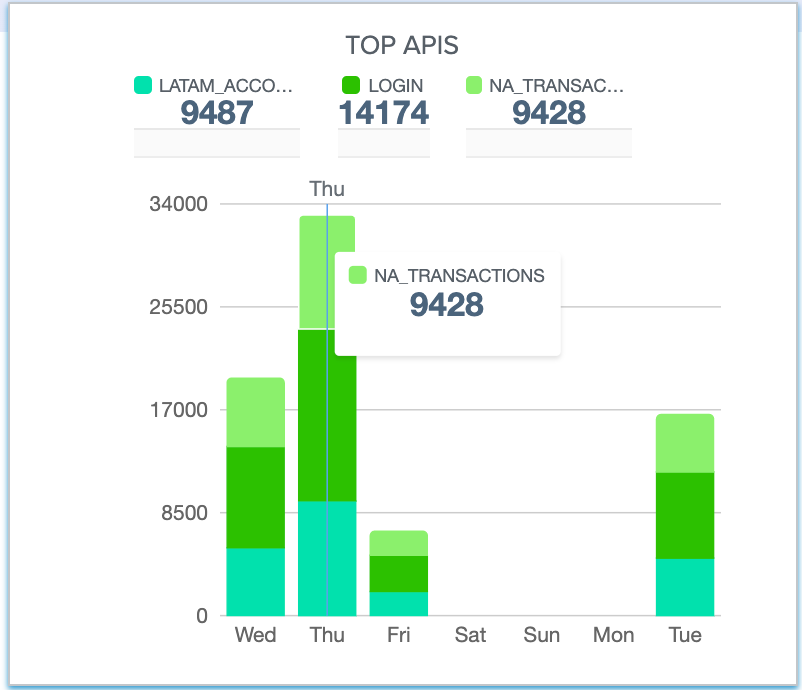
Top APIs requests and IoA breakdown |
|
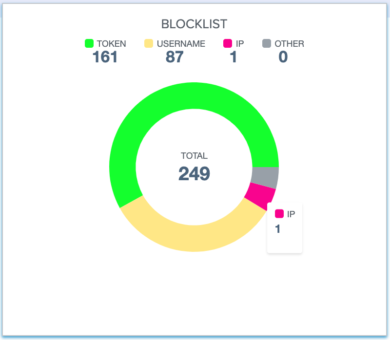
Distribution of blocklists by client type |
|
IoAs management breakdown by client type and client |
Dashboard chart types
The charts are all interactive. You can:
-
Hover over any colored area of a pie or bar chart to see additional details.
-
Move the mouse horizontally on a line chart to see the plotted value.
-
Click on the period bar to change the reporting period: Last six months, last month, last week, or last day.
-
Use a filter to change a chart appearance. The diagrams below and in subsequent sections are representative examples. Try the filters to see what works best for you.
Filtered charts offer additional information. Typical cases are shown below.

