Form Connector
The Form connector lets you include branded forms and messages in your PingOne DaVinci flow.
You can use the Form connector to:
-
Build flows that include user experiences that you create on the Experiences > Forms tab in PingOne.
-
Show messages using the branding that you define on the Experiences > Branding & Themes tab in PingOne.
|
Forms are only supported in flows that integrate with your application using the Redirect method. |
Setup
Setting up forms in PingOne
Creating a form
If you want to include a form in your flow, create it in PingOne. Learn more in Creating a form.
Configuring branding for a custom message
If you want to include a branded message in your flow, configure your branding in PingOne. For help, refer to Branding and themes.
Setting up the Form connector
In PingOne DaVinci, add a Form connector. For help, refer to Adding a connector.
This connector doesn’t have a configuration at the environment level. You configure it in your flow instead.
Using the connector in a flow
Including a form in a flow
The Show Form capability lets you present any form that you create with the drag-and-drop form builder. You can optionally prepopulate form fields with variables from your flow.
Learn more about creating forms in Creating a form.
To add a form to a PingOne DaVinci flow:
-
In your PingOne DaVinci flow, add the Form connector.
-
Select the Show Form capability.
-
Select the node that appears in your flow.
-
In the Form list, select a form that you created in your PingOne environment.
-
In the Form Theme list, select a theme for the form. You can select Use Theme ID to enter the Theme ID associated with a theme configured in User Experience > Branding and Themes in the PingOne admin console.
This list is populated with themes configured in PingOne under User Experience > Branding & Themes. Each theme also has a unique Theme ID that can be copied and pasted into the connector after selecting Use Theme ID.
If no theme is selected, the default PingOne Active Theme displays.
-
Configure the fields displayed.
The fields vary depending on the kind of from you’re configuring. Learn more in Creating a form.
Branching from Show Form outcomes
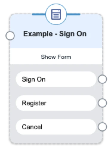
When you select a form, the Show Form node generates its outcomes from the components in that form.
-
Outcomes display in a list below the node.
-
Outcomes are shown automatically for each interactive element on the form, including:
-
Buttons
-
Links
-
Submit methods (for example, submit button, polling component, FIDO2 button, or multi-factor authentication (MFA) device selection)
-
-
You can branch directly from each outcome.
-
Outcome labels use the originating form component’s label. If the label is longer than 15 characters, the UI truncates it and adds an ellipsis. If no label is available, the component key is used.
Configuring conditional component visibility
You can configure a form in your PingOne admin console with conditional component visibility. Learn more in Configuring conditional component visibility. Use the Show Form capability to include the form in your PingOne DaVinci flow. The Form connector then applies the conditional visibility you configured.
To configure conditional component visibility:
-
In your PingOne DaVinci flow, add the Form connector.
-
Select the Show Form capability.
-
In the Form list, select the form you configured with conditional component visibility in your PingOne admin console.
-
In the Component Visibility field, you can populate the Value for the Key associated with each component that was either Hidden by default or Shown by default when you created the form.
-
For each Key, select a variable from your flow that will act as a Boolean to show or hide the components associated with the key.
-
Click Apply.
Configuring FIDO2 client error routing
When a form contains a FIDO2 component, the Show Form (Legacy) capability includes a Use Legacy FIDO2 Error Handling toggle. This toggle controls how client-side FIDO2/WebAuthn errors are surfaced in your flow. Enable Use Legacy FIDO2 Error Handling for easier decisioning based on client-side FIDO2 errors.
| Toggle state | Behavior |
|---|---|
Disabled (default) |
Client-side FIDO2 errors continue to the success (true) path. Backward-compatible with existing flows. |
Enabled |
Client-side FIDO2 errors are routed to the false branch as a typed |
|
For the Show Form capability, client-side FIDO2 errors are always routed to the error outcome. No toggle is required. |
When a FIDO2 client-side error occurs and Use Legacy FIDO2 Error Handling is enabled, the error output on the false branch contains:
| Field | Description |
|---|---|
|
DOMException error name, such as |
|
Legacy numeric error code, where applicable. |
|
Human-readable description of the error. |
Common error names include:
-
NotAllowedError: The user cancelled the operation. -
SecurityError: The relying party ID doesn’t match the current origin. -
AbortError: The operation was aborted. -
InvalidStateError: The authenticator is in an invalid state.
You can find the full list in the Web IDL DOMException spec.
To configure flow branching on FIDO2 client errors:
-
Connect the false branch of the Show Form (Legacy) node to your error-handling logic.
-
Use
error.nameto route to specific paths. For example, branch onNotAllowedErrorto prompt the user to try again, or onSecurityErrorto display a security warning. -
Use
error.codeanderror.messagefor logging or additional user-facing context.
Showing a message with your branding
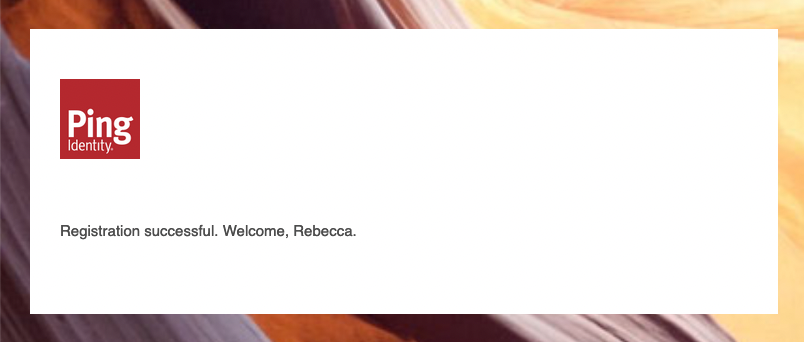
The Show Branded Message capability lets you show the user a message within a frame that’s branded according to the settings on the Experiences > Branding & Themes tab in PingOne.
-
In your flow, add the Form connector and select the Show Branded Message capability. Select the node that appears in your flow.
-
In the Message field, enter static text or click {} to include variables from your flow.
-
In the Form Theme list, select a theme for the branded message.
This list is populated with themes configured in PingOne under User Experience > Branding & Themes. Each theme also has a unique Theme ID that can be copied and pasted into the connector after selecting Use Theme ID.
If no theme is selected, the default PingOne Active Theme will be displayed.
-
Click Apply.
Capabilities
Show Form (Legacy)
Show a form from the drag-and-drop form builder.
Show details
-
Properties
-
Input Schema
-
Output Schema
- Form dropDown required
-
The form to show. You can add forms in PingOne > User Experience > Forms.
- Forms link
- Link with PingOne User toggleSwitch
-
When enabled, DaVinci creates or updates a linked PingOne user account using attributes from the external IdP.
- PingOne Population dropDown
-
The PingOne population to use when authenticating the user.
-
Use Population ID (Default)
-
- Population ID textField
-
The ID of the PingOne population to use when authenticating the user, such as “aa4b3e81-cf7e-8685-4b7b-7ec89cfcf7c8”.
- Initial Field Values keyValueList
-
Optionally provide a value to pre-populate the fields in your form. Users can keep the pre-populated value or change it before submitting the form.
- Image sectionLabel
- Image URLs keyValueList
-
The URL for the image to show, such as "https://example.com/image.jpg".
- Hyperlink URLs keyValueList
-
The URL for the image hyperlink, such as "https://example.com/sign-up".
- Dynamic Text keyValueList
-
Provide a string to populate the dynamic text in your form. Dynamic text is defined in Translatable Rich Text and Label fields by wrapping a key in curly braces, such as {{userFirstName}}.
- Component Visibility keyValueList
-
For form components with a visibility setting of "Show by default" or "Hide by default", this table allows you to override the default visibility. Provide a value of "true" to show a component, or provide a value of "false" to hide a component. If no boolean is provided, each component follows its own visibility setting. Visibility keys are defined in your form. You can override the visibility of multiple form components with one boolean value by setting the same visibility key for all of the components.
- Device Profiling sectionLabel
- Enable Device Profiling toggleSwitch
-
Enable PingOne Protect SDK to collect device information.
- Include Behavioral Data toggleSwitch
-
When enabled, collects behavioral data to identify non-human activity. Enable Device Profiling must be enabled beforehand.
- Enable Universal Device Identification toggleSwitch
-
Identify the device via a unique device ID combined with a digital signature that ensures information collected about the device has not been tampered with.
- Enable PingID Agent toggleSwitch
-
When enabled, the Signals SDK collects attributes from the PingID Device Trust Agent.
- PingID Agent Timeout (ms) textField
-
The time, in milliseconds, for establishing a connection with the PingID Device Trust Agent. If left blank, the default value is set by the Signals SDK. If specified, the value must be between 200 and 10,000 milliseconds.
- PingID Agent Port textField
-
The port number to use when connecting to the PingID Device Trust Agent. If left blank, the default port 9400 will be used.
- Enable IAF Detection (Experimental) toggleSwitch
-
Identify the agent used to access the application and detect if it is an IAF (Intelligent Automation Framework) agent.
- Agreement sectionLabel
- Agreement dropDown required
-
The agreement to show to the user. For a dynamic agreement, select Use Agreement ID and enter a value in the Agreement ID field.
-
Use Agreement ID (Default)
-
- Agreement ID textField
-
Enter the ID of the agreement to show, such as "68373acc-c0ef-4258-b69d-8152320a8237". This allows you to show a different agreement depending on the flow context
- Social Login sectionLabel
- Application Return URL textField
-
When using the embedded flow player widget and an IdP/Social Login connector, provide a callback URL to return back to the application.
- Authentication Method Source dropDown required
-
Determines where to get the list of authentication methods to present to the user. Select an MFA policy, specify a policy ID, or specify the exact authentication method list.
-
Use current default MFA policy (Default)
-
Use MFA Policy ID
-
Use Custom Authentication Method List
-
- MFA Policies link
- MFA Policy ID textField required
-
The ID of the MFA Policy to use during flow execution, such as "aa4b3e81-cf7e-8685-4b7b-7ec89cfcf7c8".
- Custom Authentication Method List textField required
-
The list of MFA authentication methods that you want to make available to the user, such as "EMAIL,TOTP". To allow all devices, enter "EMAIL, MOBILE, SMS, VOICE, TOTP, FIDO2, MAGIC_LINK, YUBIKEY, OATH_TOKEN, WHATSAPP, PINGID_DESKTOP_GEN2". Separate multiple values with a comma.
- Enable Magic Link Authentication toggleSwitch
-
When enabled, the Magic Link option is available in the authentication method list.
- User ID textField required
-
The ID of the user to authenticate, such as "488e2f16-b765-4620-833d-f673669fecf6".
- Enable Polling toggleSwitch
-
Use polling to loop this part of the flow, or a challenge to pause the flow on this node, while waiting for another part of the flow to complete.
- pollInterval textField
-
The amount of time in milliseconds to wait between each polling status check.
Default:
2000 - pollRetries textField
-
The maximum number of times to check the polling status before failing, such as 60.
Default:
60 - pollChallengeStatus toggleSwitch
-
When enabled, the form remains on the screen while DaVinci polls a challenge variable in another branch of the flow. When disabled, the flow continues past the form and loops at the next Continue Polling node.
- challenge textField
-
Select a challenge variable from your flow, such as from a Challenge or Flow Conductor node. When this challenge is completed in another branch of the flow, the main flow continues past the form.
- QR Code sectionLabel
- QR Code Contents textField required
-
The URL, app link, code, or other string to represent in the QR code, such as "https://example.com", "myapp://section/page", or “123a-45b-678c".
-
default object
-
language string
-
properties object
-
form string required
-
theme string required
-
themeId string
-
linkWithP1User boolean
-
population string
-
populationId string
-
formData array
-
imageUrls array
-
hyperlinkUrls array
-
enableRisk boolean
-
collectBehavioralData boolean
-
universalDeviceIdentification boolean
-
pingidAgent boolean
-
pingidAgentTimeout string
-
pingidAgentPort string
-
isIAFDetectionEnabled boolean
-
authenticationMethodSource string
-
mfaPolicyId string
-
authenticationMethodList string
-
userId string
-
linkFormsUrl string
-
linkBrandingThemesUrl string
-
linkMFAPolicies string
-
challenge string
-
enablePolling boolean
-
pollInterval string
-
pollRetries string
-
pollChallengeStatus boolean
-
enableMagicLinkAuthentication boolean
-
publicKeyCredentialCreationOptions string
-
publicKeyCredentialRequestOptions string
-
-
-
output object
-
formData object
-
themeId string
-
event object
-
type string
-
buttonValue string
-
-
Show Form
Show an interactive form and branch the flow based on the outcome.
Show details
-
Properties
-
Input Schema
-
Output Schema
- Form dropDown required
-
The form to show. You can add forms in PingOne > User Experience > Forms.
- Forms link
- Link with PingOne User toggleSwitch
-
When enabled, DaVinci creates or updates a linked PingOne user account using attributes from the external IdP.
- PingOne Population dropDown
-
The PingOne population to use when authenticating the user.
-
Use Population ID (Default)
-
- Population ID textField
-
The ID of the PingOne population to use when authenticating the user, such as “aa4b3e81-cf7e-8685-4b7b-7ec89cfcf7c8”.
- Initial Field Values keyValueList
-
Optionally provide a value to pre-populate the fields in your form. Users can keep the pre-populated value or change it before submitting the form.
- Image sectionLabel
- Image URLs keyValueList
-
The URL for the image to show, such as "https://example.com/image.jpg".
- Hyperlink URLs keyValueList
-
The URL for the image hyperlink, such as "https://example.com/sign-up".
- Dynamic Text keyValueList
-
Provide a string to populate the dynamic text in your form. Dynamic text is defined in Translatable Rich Text and Label fields by wrapping a key in curly braces, such as {{userFirstName}}.
- Component Visibility keyValueList
-
For form components with a visibility setting of "Show by default" or "Hide by default", this table allows you to override the default visibility. Provide a value of "true" to show a component, or provide a value of "false" to hide a component. If no boolean is provided, each component follows its own visibility setting. Visibility keys are defined in your form. You can override the visibility of multiple form components with one boolean value by setting the same visibility key for all of the components.
- Device Profiling sectionLabel
- Enable Device Profiling toggleSwitch
-
Enable PingOne Protect SDK to collect device information.
- Include Behavioral Data toggleSwitch
-
When enabled, collects behavioral data to identify non-human activity. Enable Device Profiling must be enabled beforehand.
- Enable Universal Device Identification toggleSwitch
-
Identify the device via a unique device ID combined with a digital signature that ensures information collected about the device has not been tampered with.
- Enable PingID Agent toggleSwitch
-
When enabled, the Signals SDK collects attributes from the PingID Device Trust Agent.
- PingID Agent Timeout (ms) textField
-
The time, in milliseconds, for establishing a connection with the PingID Device Trust Agent. If left blank, the default value is set by the Signals SDK. If specified, the value must be between 200 and 10,000 milliseconds.
- PingID Agent Port textField
-
The port number to use when connecting to the PingID Device Trust Agent. If left blank, the default port 9400 will be used.
- Enable IAF Detection (Experimental) toggleSwitch
-
Identify the agent used to access the application and detect if it is an IAF (Intelligent Automation Framework) agent.
- Agreement sectionLabel
- Agreement dropDown required
-
The agreement to show to the user. For a dynamic agreement, select Use Agreement ID and enter a value in the Agreement ID field.
-
Use Agreement ID (Default)
-
- Agreement ID textField
-
Enter the ID of the agreement to show, such as "68373acc-c0ef-4258-b69d-8152320a8237". This allows you to show a different agreement depending on the flow context
- Social Login sectionLabel
- Application Return URL textField
-
When using the embedded flow player widget and an IdP/Social Login connector, provide a callback URL to return back to the application.
- Authentication Method Source dropDown required
-
Determines where to get the list of authentication methods to present to the user. Select an MFA policy, specify a policy ID, or specify the exact authentication method list.
-
Use current default MFA policy (Default)
-
Use MFA Policy ID
-
Use Custom Authentication Method List
-
- MFA Policies link
- MFA Policy ID textField required
-
The ID of the MFA Policy to use during flow execution, such as "aa4b3e81-cf7e-8685-4b7b-7ec89cfcf7c8".
- Custom Authentication Method List textField required
-
The list of MFA authentication methods that you want to make available to the user, such as "EMAIL,TOTP". To allow all devices, enter "EMAIL, MOBILE, SMS, VOICE, TOTP, FIDO2, MAGIC_LINK, YUBIKEY, OATH_TOKEN, WHATSAPP, PINGID_DESKTOP_GEN2". Separate multiple values with a comma.
- Enable Magic Link Authentication toggleSwitch
-
When enabled, the Magic Link option is available in the authentication method list.
- Enable Polling toggleSwitch
-
Use polling to loop this part of the flow, or a challenge to pause the flow on this node, while waiting for another part of the flow to complete.
- pollInterval textField
-
The amount of time in milliseconds to wait between each polling status check.
Default:
2000 - pollRetries textField
-
The maximum number of times to check the polling status before failing, such as 60.
Default:
60 - pollChallengeStatus toggleSwitch
-
When enabled, the form remains on the screen while DaVinci polls a challenge variable in another branch of the flow. When disabled, the flow continues past the form and loops at the next Continue Polling node.
- challenge textField
-
Select a challenge variable from your flow, such as from a Challenge or Flow Conductor node. When this challenge is completed in another branch of the flow, the main flow continues past the form.
- QR Code sectionLabel
- QR Code Contents textField required
-
The URL, app link, code, or other string to represent in the QR code, such as "https://example.com", "myapp://section/page", or “123a-45b-678c".
-
default object
-
language string
-
properties object
-
form string
-
theme string
-
themeId string
-
linkWithP1User boolean
-
population string
-
populationId string
-
formData array
-
imageUrls array
-
hyperlinkUrls array
-
enableRisk boolean
-
collectBehavioralData boolean
-
universalDeviceIdentification boolean
-
pingidAgent boolean
-
pingidAgentTimeout string
-
pingidAgentPort string
-
isIAFDetectionEnabled boolean
-
authenticationMethodSource string
-
mfaPolicyId string
-
authenticationMethodList string
-
linkFormsUrl string
-
linkBrandingThemesUrl string
-
linkMFAPolicies string
-
challenge string
-
enablePolling boolean
-
pollInterval string
-
pollRetries string
-
pollChallengeStatus boolean
-
enableMagicLinkAuthentication boolean
-
publicKeyCredentialCreationOptions string
-
publicKeyCredentialRequestOptions string
-
-
p1UserId string
-
-
output object
-
formData object
-
themeId string
-
event object
-
type string
-
buttonValue string
-
-
Show Branded Message
Show a message with your PingOne branding theme.
Show details
-
Properties
-
Input Schema
-
Output Schema
- Message textArea
-
The message to show to the user.
- Button Text textField
-
The text to show on the continue button, such as "Submit" or "Continue".
Default:
Submit - showContinueButton toggleSwitch
-
When enabled, the user interface includes a button that allows the user to continue the flow.
-
default object
-
properties object
-
theme string required
-
themeId string
-
message string
-
buttonText string
-
showContinueButton boolean
-
-
-
output object
-
themeId string
-