Choice Collector node
The Choice Collector node defines two or more options to present to the user during authentication.
Example
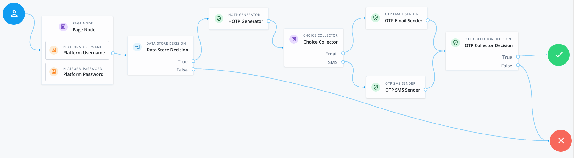
The following example demonstrates using the Choice Collector node in a multi-factor authentication (MFA) journey to provide the user with a choice to receive the one-time password (OTP) by email or SMS:
-
The Page node containing the Platform Username node and Platform Password node prompts for credentials.
-
The Data Store Decision node validates the username-password credentials.
-
The HOTP Generator node generates an eight-digit OTP.
-
The Choice Collector node prompts the user to choose whether they want to receive the OTP by email or SMS.
-
If the user chooses email, the OTP Email Sender node sends the OTP to the user’s email address.
-
If the user chooses SMS, the OTP SMS Sender node sends the OTP to the user’s mobile number.
-
-
The OTP Collector Decision node prompts the user to enter the OTP they received and verifies it. If the OTP is correct, the user is authenticated.
Availability
| Product | Available? |
|---|---|
PingOne Advanced Identity Cloud |
Yes |
PingAM (self-managed) |
Yes |
Ping Advanced Identity Software (self-managed) |
Yes |
Inputs
The node can read the authLevel and targetAuthLevel from the incoming node state if they exist.
When present, the node uses them to filter the choices available to the user to ensure only choices that can meet or exceed the targetAuthLevel are shown.
Configuration
| Property | Usage | Availability | ||
|---|---|---|---|---|
Choices |
Enter two or more choice strings to display to the user. To remove a choice, select its Delete icon (). |
All node versions |
||
Default Choice |
Enter the value of the choice to be selected by default.
|
All node versions |
||
Prompt |
Enter the text to display to the user when presenting the choices. |
All node versions |
||
Render as Radio Buttons |
Present the choices to the user as radio buttons instead of in a list.
When enabled, the node includes the Use this option if you want to display choices as radio buttons without needing to use a Page node in your journey. If the Field Display Type property is also set, the option selected there takes precedence over this setting. |
|||
Field Display Type |
The format of options presented to the user.
Possible values are:
|
All node versions |
Callbacks
The node sends a ChoiceCallback, which displays the list of Choices to the user and contains the Prompt.
When Render as Radio Buttons is enabled, the node includes the radio field set to true in the ChoiceCallback.
This advises the end-user UI to render the choices as a vertical group of radio buttons.
To render dynamic choices as radio buttons in a Scripted Decision node, use the callbacksBuilder.radioChoiceCallback request method.
This subclass of ChoiceCallback provides access to the radio field.
Learn more in Use callbacks.