Customize the look and feel of PingOne authentication pages
This tutorial walks you through ways to customize your PingOne authentication experience to better align with your organization’s brand. In this tutorial, you’ll change the look and feel of registration and sign-on forms in PingOne by applying your own branding and making stylistic changes using a theme.
Steps
-
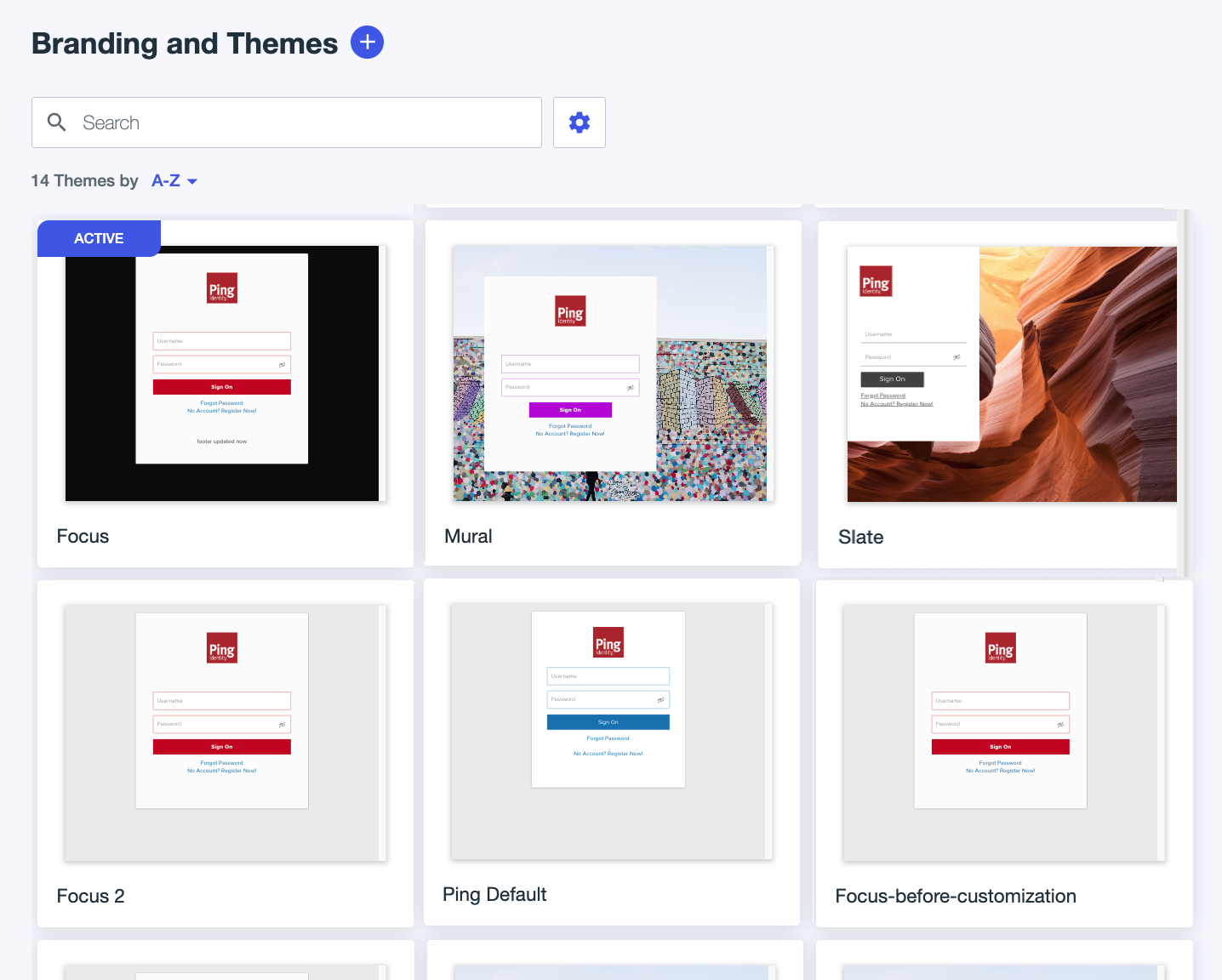
In the PingOne admin console, go to User Experience > Branding and Themes.
-
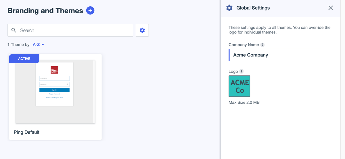
Click the icon to open the Global Settings panel.
These settings apply to all themes in the environment.
-
Enter or edit the branding details:
-
Company name: The name of your company as you want it to appear to end users.
Enter
Acme Company. -
Logo: An image to represent the environment to end users.
Click the image and select Upload a New Image to upload an image from your computer to use as the Acme Company logo. This logo is used when you create a new theme, but doesn’t apply to existing themes.
The maximum logo size is 2 MB.
-
-
Click Save.
-
Click the icon to add a new theme.
-
On the Choose a Base Theme page, click Slate.
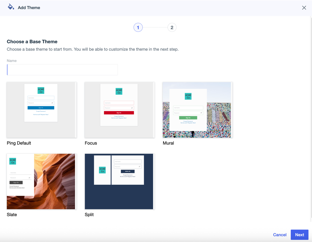
You can see that the logo for the base themes matches what you uploaded in Global Settings.
-
In the Name field, enter
Acme Theme. -
Click Next and select the tabs on the Customize page to review and change settings for the different page types.
Page previews display in the left panel, and you configure settings in the Theme Styles panel on the right. The previews update in real time as you make changes to the settings. To switch between previews for desktop or mobile devices, click the Desktop or Mobile icon (
 ).
). -
Let’s update a few settings for the sign-on and registration forms:
-
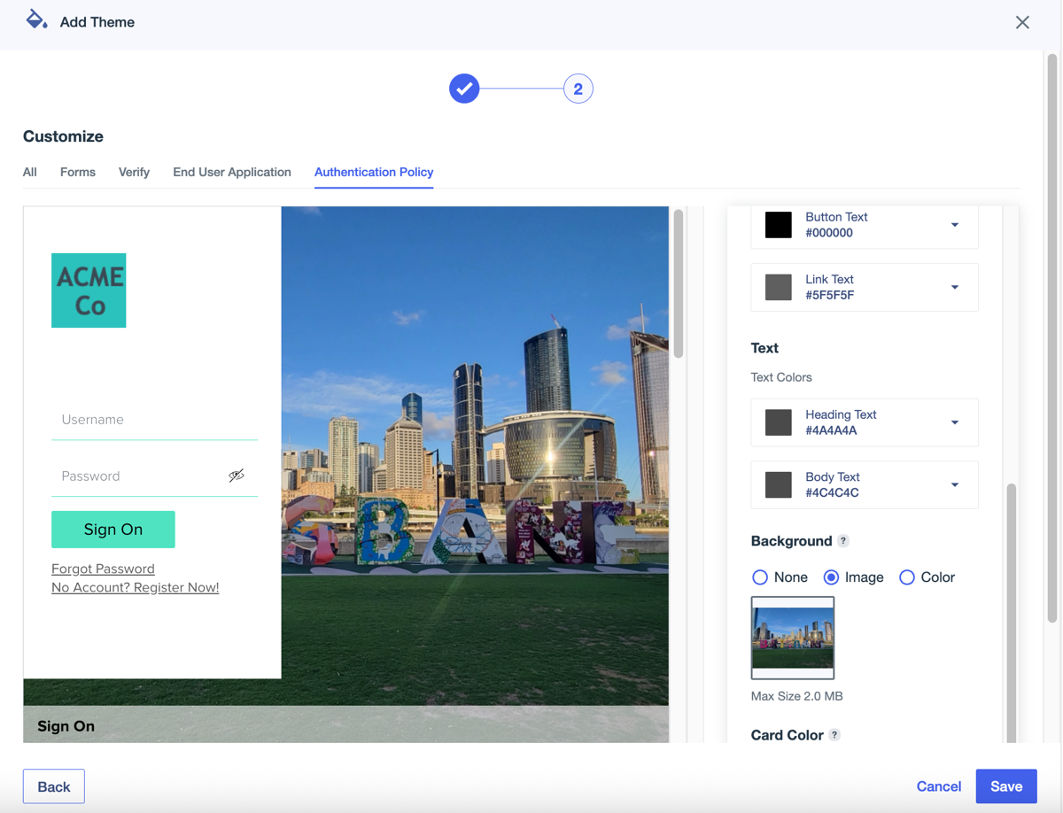
Click the Authentication Policy tab.
-
In the right panel, locate the Button section, select Button Fill and select one of the preconfigured color options.
For the purposes of this tutorial, we selected aqua. Notice the color of the button in the preview panel changes to match your selection.
Click outside of the color picker to return to the settings panel.
-
Click Button Text and select another color.
The color of the text inside the button update based on your selection.
For the purposes of this tutorial, we selected black.
-
Scroll to the Background section, click the image, and select Upload New Image.
-
Select an image on your computer and click Open.
Result:
The background image for the theme updates.
-
-
Click Save.
-
On the Branding and Themes page, hover over the Acme Theme to display the More Options (⋮) icon in the right corner.
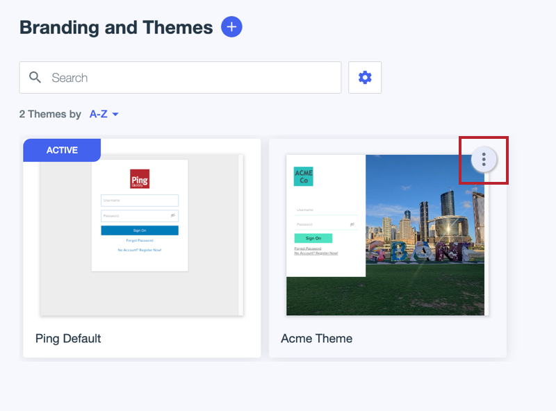
-
Click the More Options (⋮) icon and select Set As Active Theme.
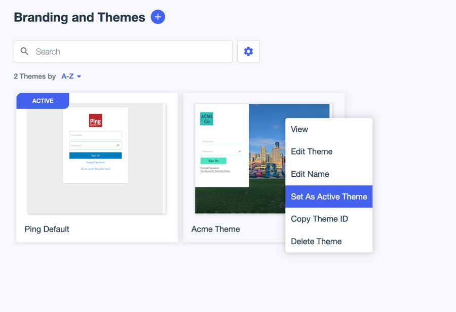
Result
Acme Theme is now the active theme for the environment.
|
It can take up to 5 minutes for the new theme to appear to end users. |
Learn More
Learn more about the many options for theme configuration in Branding and Themes.