Editing a theme
PingOne delivers several built-in themes. Use the Branding and Themes page to modify the built-in themes or themes that you’ve added to the environment to better match your company’s branding. The customized themes use your Company Name and Logo if you added them in Global Settings.
|
If you edit a theme, you are responsible for ensuring that your customizations meet accessibility standards. |
Steps
-
In the PingOne admin console, go to User Experience > Branding and Themes and browse or search for the theme you want to edit.
-
To change the theme name, click the More options (⋮) icon and select Edit Name.
-
Update the Theme Name and click Save.
-
To customize the other settings for the theme, click the More options (⋮) icon and select Edit Theme.
Page previews display in the left panel, and you configure the settings in the Theme Styles panel on the right. The previews update in real time as you make changes to the settings. To switch between previews for desktop or mobile devices, click the Desktop or Mobile icon (
 ).
).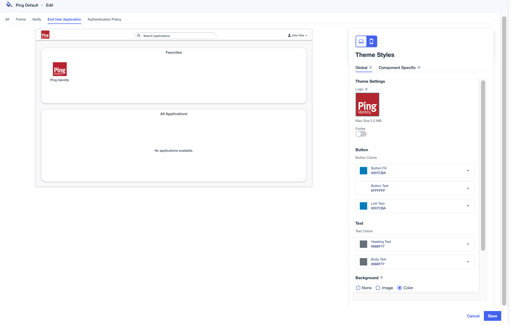
All page types include global theme settings, which apply across all components. Some page types also have Component Specific settings, which apply only to the specific component.
-
Click the All tab to edit global theme settings that apply to all pages that aren’t affected by component-specific styles.
Setting Description Logo
An image to represent the environment. Hover over the box and click the Camera icon () to upload an image. Select an image in
.jpg,.jpeg,.gif, or.pngformat up to 2 MB in size.To change the image used for the logo, click and select Upload New Image.
To delete a logo from a theme, click and select Remove Image.
Footer
Text that appears at the bottom of each page.
-
Click the toggle to the right (blue) to enable footer text, then enter the text.
-
Click + Add Footer, and select PlainText or HTML.
By default, English is selected in the Language list. Before you can create footers in other languages, you must create and save one in English. Languages with footers are marked with a green dot and move to the top of the list.
-
Enter text in the Footer Content field.
If you selected HTML for your footer type, you can include the following HTML elements and associated attributes in your footer. All elements support the
classandstyleattributes.-
a(href, target)To use an
href, you must include the protocol in the address, such asftp,http,https,mailto,tel, orsms. -
b -
blockquote(cite) -
br -
cite -
code -
dd -
dl -
dt -
em -
h1 -
h2 -
h3 -
hr -
i -
img(src, srcset, alt, title, width, height) -
li -
ol -
p -
pre -
q(cite) -
small -
span -
strike -
strong -
sub -
sup -
u -
ul
-
-
Click Save.
-
To add footers in additional languages, click the Pencil icon (), select a different language, and add your translated text.
You can’t mix footer types. All footers must be either plain text or HTML, depending on what you selected in step 2.
-
Click Save.
Button
Configure the color of the buttons, such as the Sign on and Save buttons:
-
Button Fill: The background color for the buttons.
-
Button Text: The color of the text on the buttons.
-
Link Text: The color of the text for links displayed on the buttons.
Text
The color of the text on the pages:
-
Heading Text: The color of the text in headings.
-
Body Text: The color of non-heading text.
Background
The background to use on each page.
-
None: Do not use a background.
-
Image: To use an image for the background, hover over the box and click the Camera icon () to upload an image. Select an image in
jpg,jpeg,gif, orpngformat up to 2 MB in size.To change the image used for the background, click and select Upload New Image.
To delete a background image from a theme, click and select Remove Image.
-
Color: Select a color to use for the background.
Card Color
The color of the box around form fields.
-
-
On the Forms tab, click one of the tabs in the Theme Styles panel:
-
Global: Edit global theme settings and preview the updated appearance of your PingOne DaVinci forms.
-
Component Specific: Edit settings that only affect the appearance of your forms.
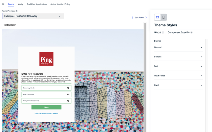
Your environment must include PingOne DaVinci and at least one DaVinci form to configure theme styles for forms.
Your selections affect all forms in the environment, and can’t be set at the form level. You can select a form from the Form Preview list to preview it with theme styling applied. You can also click Edit Form to open the Forms page in a separate tab and make updates the your forms as necessary.
Learn more in DaVinci Forms.
- General
-
Use these settings to change the appearance of general elements in your forms.
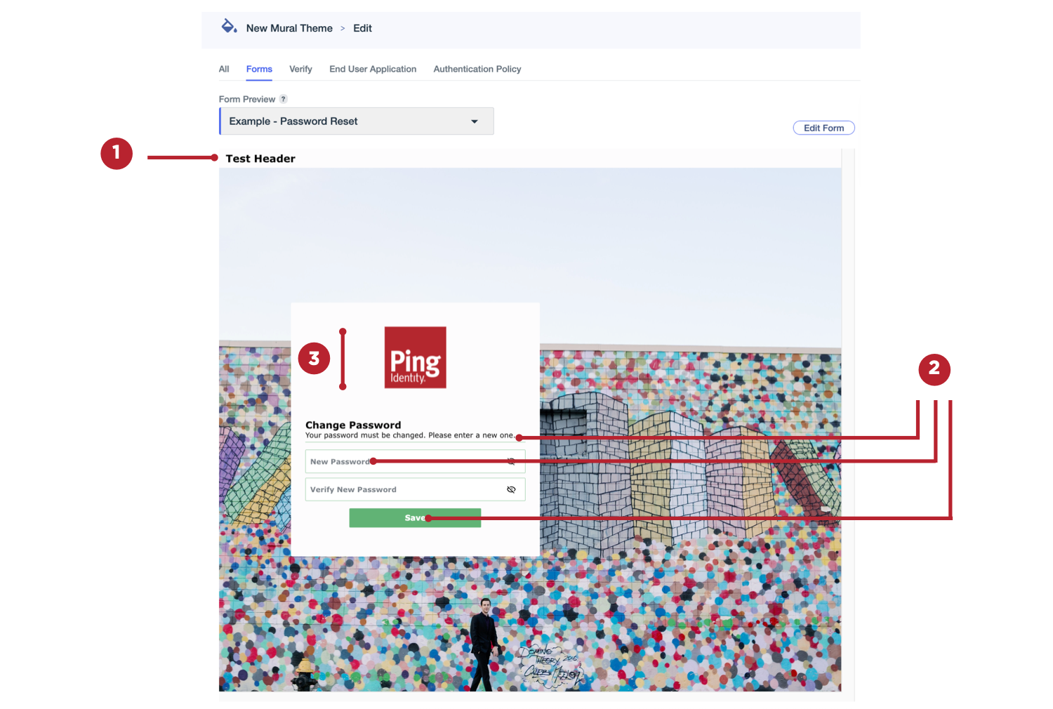
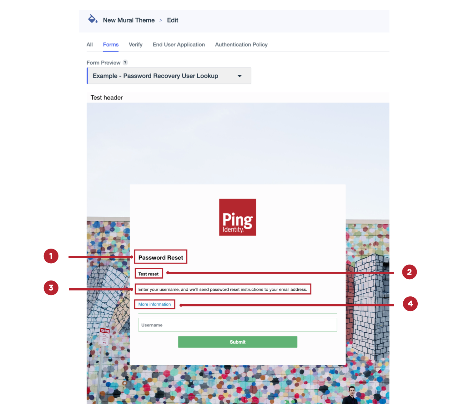
Setting Description Header (1)
Text that appears at the top of each form page.
To add headers:
-
Click the toggle to the right (blue) to enable header text.
-
Click + Add Header, and select PlainText or HTML.
By default, English is selected in the Language list. Before you can create headers in other languages, you must create and save one in English. Languages with headers are marked with a green dot and move to the top of the list.
-
Enter text in the Header Content field.
If you selected HTML for your header type, you can include the following HTML elements and associated attributes in your header. All elements support the
classandstyleattributes.-
a(href, target)To use an
href, you must include the protocol in the address, such asftp,http,https,mailto,tel, orsms. -
b -
blockquote(cite) -
br -
cite -
code -
dd -
dl -
dt -
em -
h1 -
h2 -
h3 -
hr -
i -
img(src, srcset, alt, title, width, height) -
li -
ol -
p -
pre -
q(cite) -
small -
span -
strike -
strong -
sub -
sup -
u -
ul
-
-
Click Save.
-
To add headers in additional languages, click , select a different language, and add your translated text.
You can’t mix header types. All headers must be either plain text or HTML, depending on what you selected in step 2.
-
Click Save.
Global Font (2)
The font to use for all form text, including field labels and button text.
Logo Height (3)
Set a height for your form logo. The maximum allowed height is 150 px.
Focus Color
Select an outline color to apply to a field when it’s in focus.
This setting can’t be previewed because it requires user interaction to display.
-
- Buttons
-
Use these settings to change the appearance of buttons in your forms.
Setting Description Button Border (1)
Select a color for the borders around the form buttons.
Hover State Fill (2)
Select a button color to use when a user hovers over them.
This setting can’t be previewed because it requires user interaction to display.
Hover State Border (1)
Select a color the borders of the buttons in your forms become when a user hovers over them.
This setting can’t be previewed because it requires user interaction to display.
Hover State Button Text (3)
Select a color that the button text becomes when a user hovers over form buttons.
This setting can’t be previewed because it requires user interaction to display.
Border Weight (1)
Select a setting for the thickness of the borders around the form buttons. Allowed values range from 0 px (no border) to 4 px.
Corner Radius (4)
Select a value between 0 (square) and 25 px to configure the curvature of the button corners.
Text Size (3)
Select a font size between 8 and 24 px for the button text in your forms.
Text Weight (3)
Select a weight for the button text. For example, Extra Light or Bold.
- Text
-
Use these settings to change the appearance of specific text types in your forms.
If text formatting options were set for a particular form using the Rich Text component in the form builder, those text settings can’t be changed using the theme settings, and the preview won’t update for that form. If there were no text format changes to other forms in your environment, the theme settings are used and displayed in the preview.
Setting Description Title Text (1)
Select the size and weight of the title text (H1) in your forms.
-
Text Size: Select a font size between 8 and 24 px for form titles.
-
Text Weight: Select a weight for the title text. For example, Extra Light or Bold.
Subtitle Text (2)
Select the size, weight, and color of the subtitle text (H2) in your forms.
-
Text Size: Select a font size between 8 and 24 px for form subtitles.
-
Text Weight: Select a weight for the subtitle text. For example, Extra Light or Bold.
-
Subtitle Text: Select a color for the subtitle text in your forms.
Body Text (3)
Select the size and weight of the main body text in your forms.
-
Text Size: Select a font size between 8 and 24 px for body text.
-
Text Weight: Select a weight for the body text. For example, Extra Light or Bold.
Link Text (4)
Select the size, weight, and hover color for the links in your forms.
-
Text Size: Select a font size between 8 and 24 px for link text.
-
Text Weight: Select a weight for the link text. For example, Extra Light or Bold.
-
Link Text Hover: The color of the text when a user hovers over the link.
-
- Input Fields
-
Use these settings to change the appearance of form fields that require user input.
Setting Description Label (1)
Select the size, weight, and color of the label text for input fields in your forms.
-
Text Size: Select a font size between 8 and 24 px for field labels.
-
Text Weight: Select a weight for the field label text. For example, Extra Light or Bold.
-
Label Text: Select a color for the label text for fields.
Value (1)
Select the size, weight, and color of the text entered by users in the input fields in your forms.
-
Text Size: Select a font size between 8 and 24 px for text entered by users.
-
Text Weight: Select a weight for the text entered by users. For example, Extra Light or Bold.
-
Value Text: Select a color for the user-entered text.
These settings can’t be previewed because they require user interaction to display.
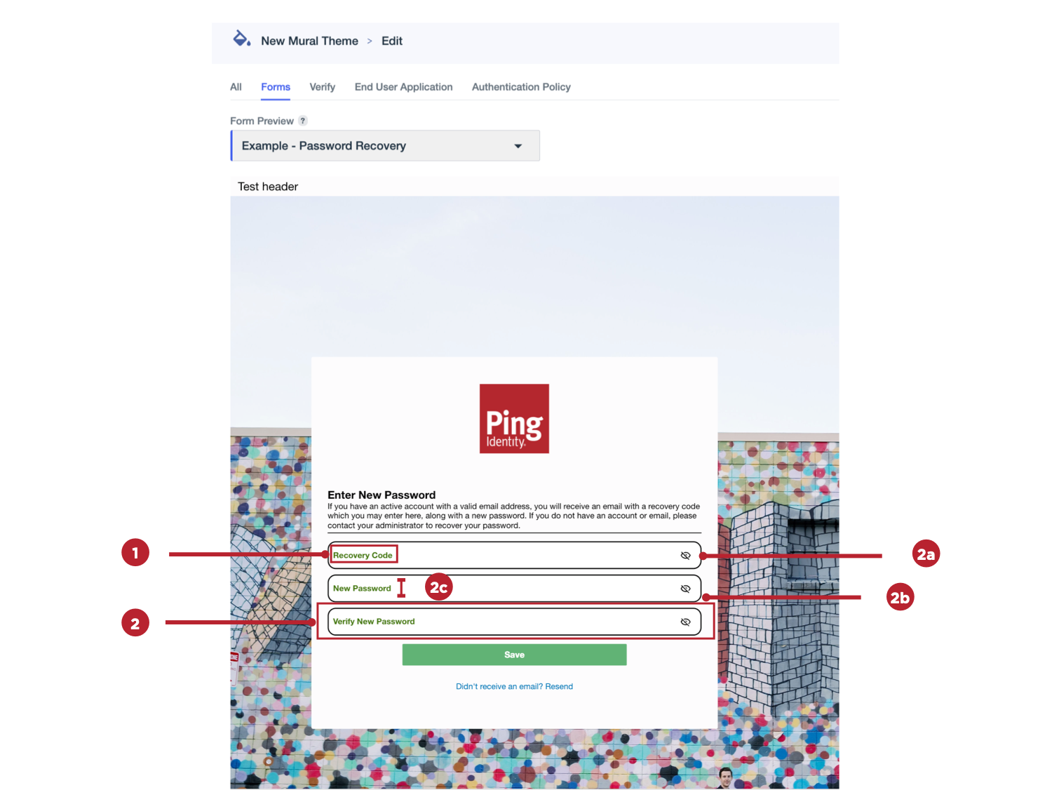
Input Box (2)
Select the border color, border weight, corner radius, and label position for input fields in your forms.
-
Border (2a): Select a color for the border around input fields.
-
Border Weight (2a): Select a setting for the thickness of the borders around the input fields. Allowed values range from 0 px (no border) to 4 px.
-
Corner Radius (2b): Select a value between 0 (square) and 25 px to configure the curvature of the input field corners.
-
Label Position (2c): Select one of the following options:
-
Float: Place the label inside the input box.
-
Default: Place the label above the input box.
-
-
- Card
-
Use these settings to change the appearance of the card that contains all of the form elements.
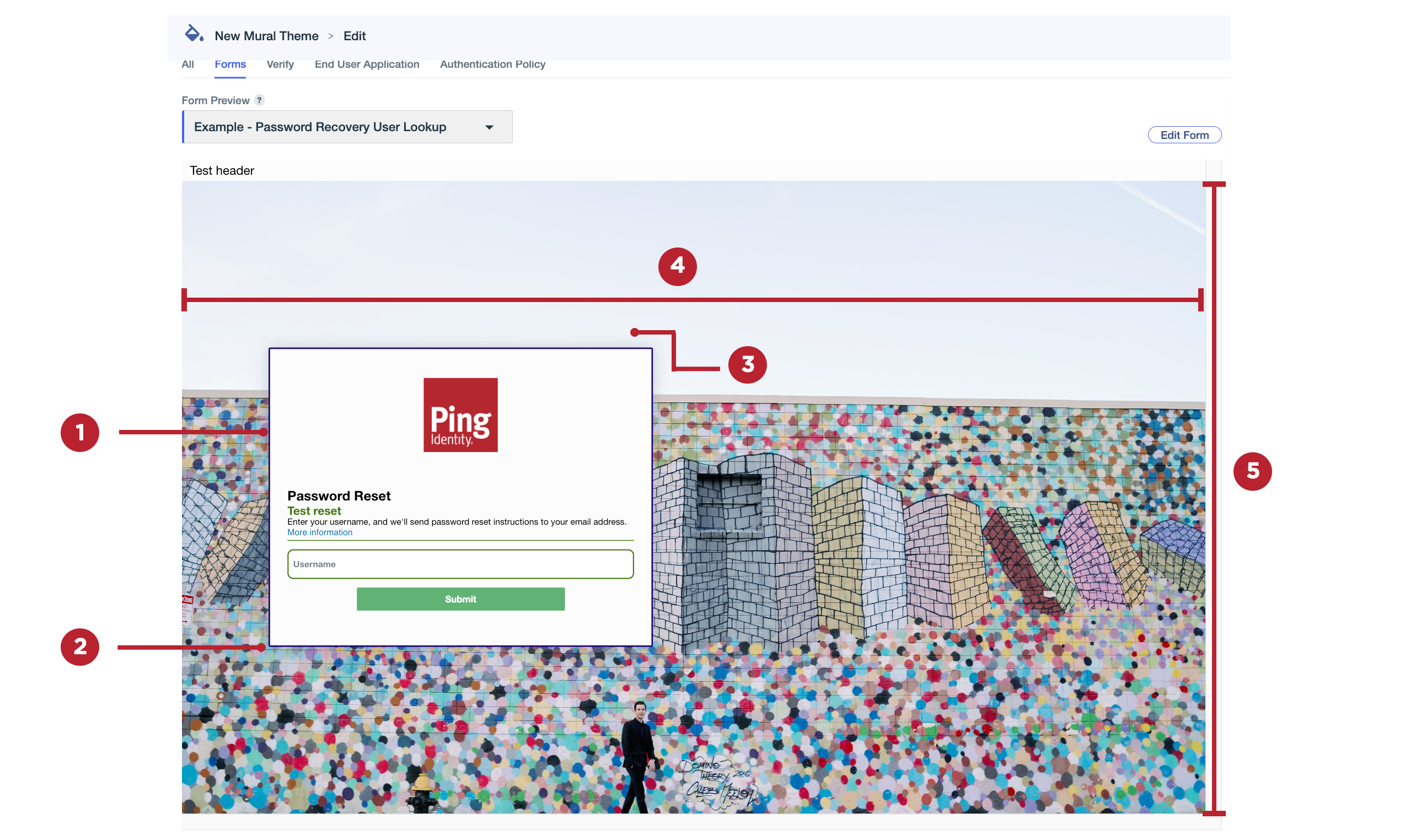
Setting Description Border (1)
Select a color for the border around the card that contains all of the form elements.
Border Weight (1)
Select a setting for the thickness of the borders around the form card. Allowed values range from 0 px (no border) to 4 px.
Corner Radius (2)
Select a value between 0 (square) and 25 px to configure the curvature of the card corners.
Shadow (3)
Apply a shadow outline to the card.
If you’re using a background image, the shadow might not display clearly, particularly if the background image is very dark.
Horizontal Alignment (4)
Select whether the card should be aligned to the left, right, or center of the form.
Vertical Alignment (5)
Select whether the card should be aligned to the top, bottom, or center of the form.
-
-
On the Verify tab, click one of the tabs in the Theme Styles panel:
-
Global: Edit global theme settings and preview the updated appearance of identity verification pages.
-
Component Specific: Edit settings that only affect the appearance of the images on identity verification pages.
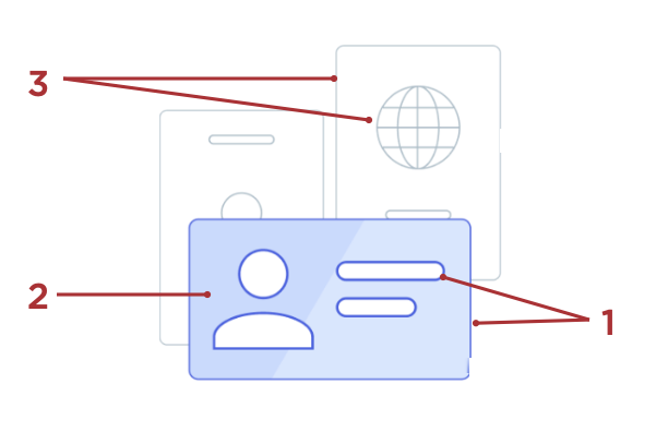
Setting Description Foreground Main (1)
The color used for the border around the front image and around the internal shapes in the front image.
Foreground Highlight (2)
The fill color used for the front image.
Background Outline (3)
The color used for the borders around the background images and around the internal shapes in the background images.
-
-
On the End User Application tab, click one of the tabs in the Theme Styles panel:
-
Global: Edit global theme settings and preview the updated appearance of system applications, such as the Application Portal and Self-Service - My Account.
-
Component Specific: Edit settings that only affect the appearance of system applications, such as the Application Portal and Self-Service - My Account.
Setting Description Background Color
The background color used for the application.
-
-
Click the Authentication Policy tab to edit global theme settings and preview the updated appearance of the sign-on and registration pages in your environment.
There are no component-specific styles for Authentication Policy.
-
Click Save.