New theme settings (early access)
Additional theme options were added for the global Footer setting, and a group of component-specific settings were added for PingOne DaVinci forms.
New options were added to the More options (⋮) menu:
-
Migrate Theme: The new footer and forms settings are available when you create a new theme, but aren’t available on legacy themes. Use the new Migrate Theme option to enable the new theme settings.
-
Clone Theme: Clone a theme to test the impact of theme changes without affecting the theme that is currently in use in production.
You can find instructions for adding or editing a theme in Branding and themes. For the purposes of early access, this topic only describes the new settings.
Additional global theme settings for footers
You can now include footers in plain text or HTML format, and you can add footers in multiple languages. We’ve also added support for several additional HTML elements.
Footers are displayed at the bottom of each page.
-
On the All tab, click the toggle next to Footer to the right (blue) to enable footer text.
-
Click + Add Footer, and select PlainText or HTML.
By default, English is selected in the Language list. Before you can create footers in other languages, you must create and save one in English. A green dot on a language in the list indicates that a footer is available in that language. Languages for which footers are added move to the top of the list.
-
Enter text in the Footer Content field.
If you selected HTML for your footer type, you can include the following HTML elements and associated attributes in your footer. All elements support the
classandstyleattributes. Newly available elements are indicated with an asterisk (*).-
a(href, target)To use an
href, you must include the protocol in the address, such asftp,http,https,mailto,tel, orsms. -
b -
blockquote(cite) -
br -
cite -
code -
dd -
dl -
dt -
em -
*
h1 -
*
h2 -
*
h3 -
*
hr -
i -
*
img(src, srcset, alt, title, width, height) -
li -
ol -
p -
pre -
q(cite) -
small -
span -
strike -
strong -
sub -
sup -
u -
ul
-
-
Click Save.
-
To add footers in additional languages, click the Pencil icon (), select a different language, and add your translated text.
You can’t mix footer types. All footers must be either plain text or HTML, depending on what you selected in step 2.
-
Click Save.
New component-specific theme settings for PingOne Forms (early access)
Before you begin
You must have:
-
A PingOne environment that includes DaVinci
-
At least one form in the environment
On the Forms tab, click the Component Specific tab on the Theme Styles panel to view and edit theme settings for PingOne Forms.
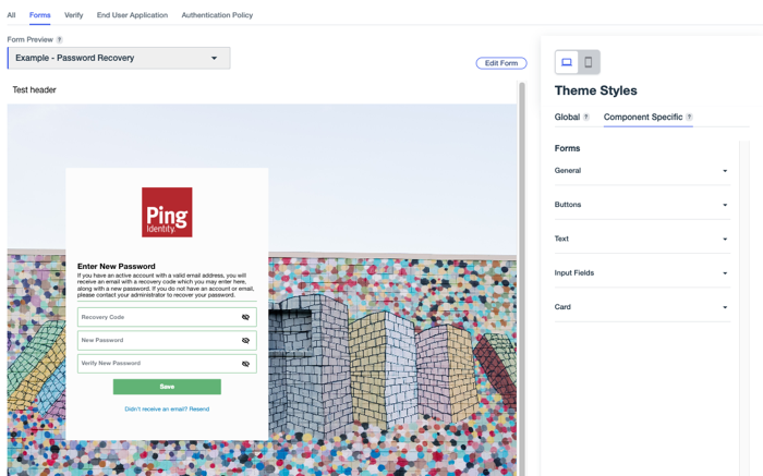
General
Use these settings to change the appearance of general elements in your forms.
| Setting | Description | ||||
|---|---|---|---|---|---|
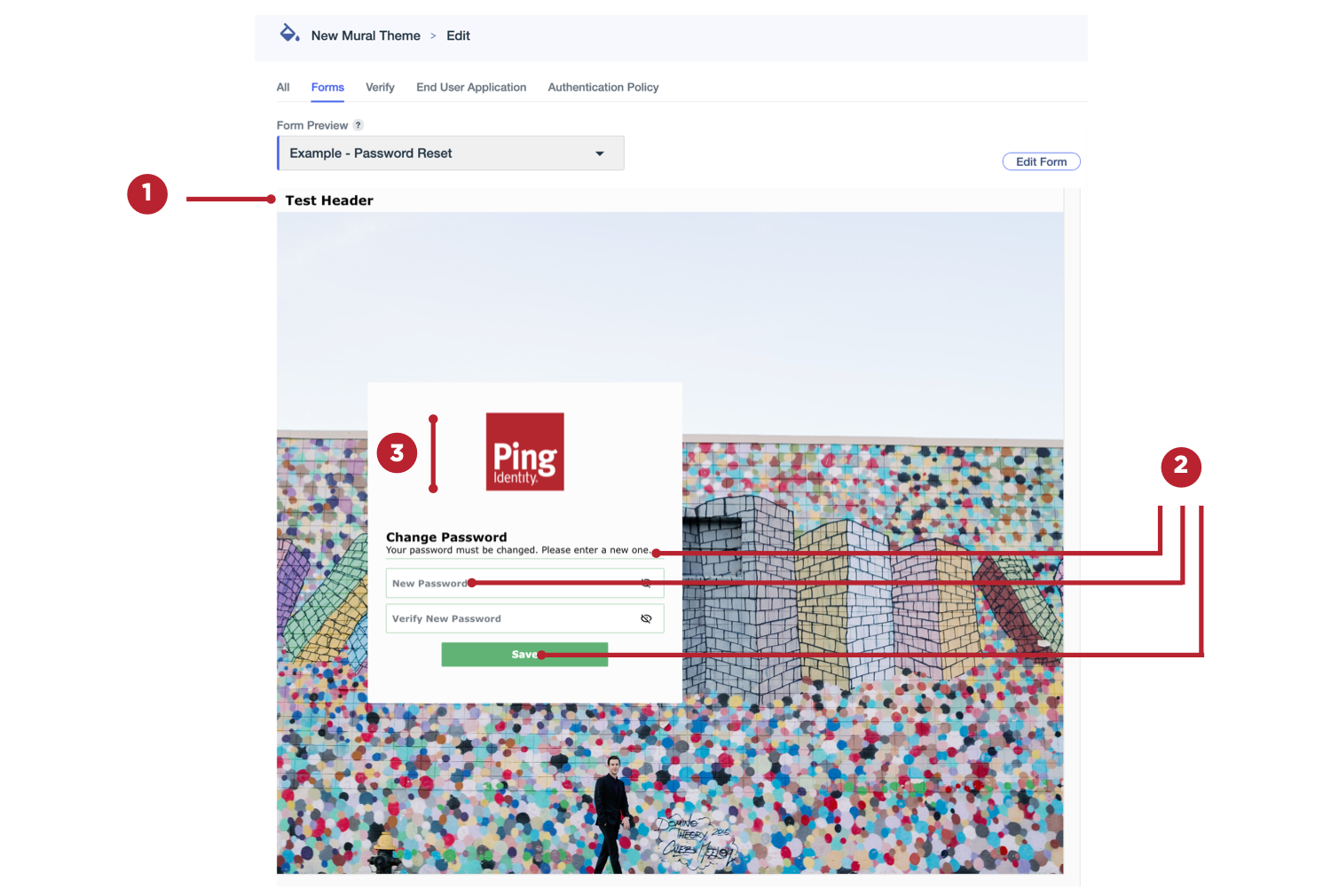
Header (1) |
Text that appears at the top of each form page. To add headers:
|
||||
Global Font (2) |
The font to use for all form text, including field labels and button text. |
||||
Logo Height (3) |
Set a height for your form logo. The maximum allowed height is 150 px. |
||||
Focus Color |
Select an outline color to apply to a field when it’s in focus.
|
Buttons
Use these settings to change the appearance of buttons in your forms.

| Setting | Description | ||
|---|---|---|---|
Button Border (1) |
Select a color for the borders around the form buttons. |
||
Hover State Fill (2) |
Select a button color to use when a user hovers over them.
|
||
Hover State Border (1) |
Select a color the borders of the buttons in your forms become when a user hovers over them.
|
||
Hover State Button Text (3) |
Select a color that the button text becomes when a user hovers over form buttons.
|
||
Border Weight (1) |
Select a setting for the thickness of the borders around the form buttons. Allowed values range from 0 px (no border) to 4 px. |
||
Corner Radius (4) |
Select a value between 0 (square) and 25 px to configure the curvature of the button corners. |
||
Text Size (3) |
Select a font size between 8 and 24 px for the button text in your forms. |
||
Text Weight (3) |
Select a weight for the button text. For example, Extra Light or Bold. |
Text
Use these settings to change the appearance of specific text types in your forms.
|
If text formatting options were set for a particular form using the Translatable Rich Text component in the form builder, those text settings can’t be changed using the theme settings, and the preview won’t update for that form. If there were no text format changes to other forms in your environment, the theme settings are used and displayed in the preview. |

| Setting | Description |
|---|---|
Title Text (1) |
Select the size and weight of the title text (H1) in your forms.
|
Subtitle Text (2) |
Select the size, weight, and color of the subtitle text (H2) in your forms.
|
Body Text (3) |
Select the size and weight of the main body text in your forms.
|
Link Text (4) |
Select the size, weight, and hover color for the links in your forms.
|
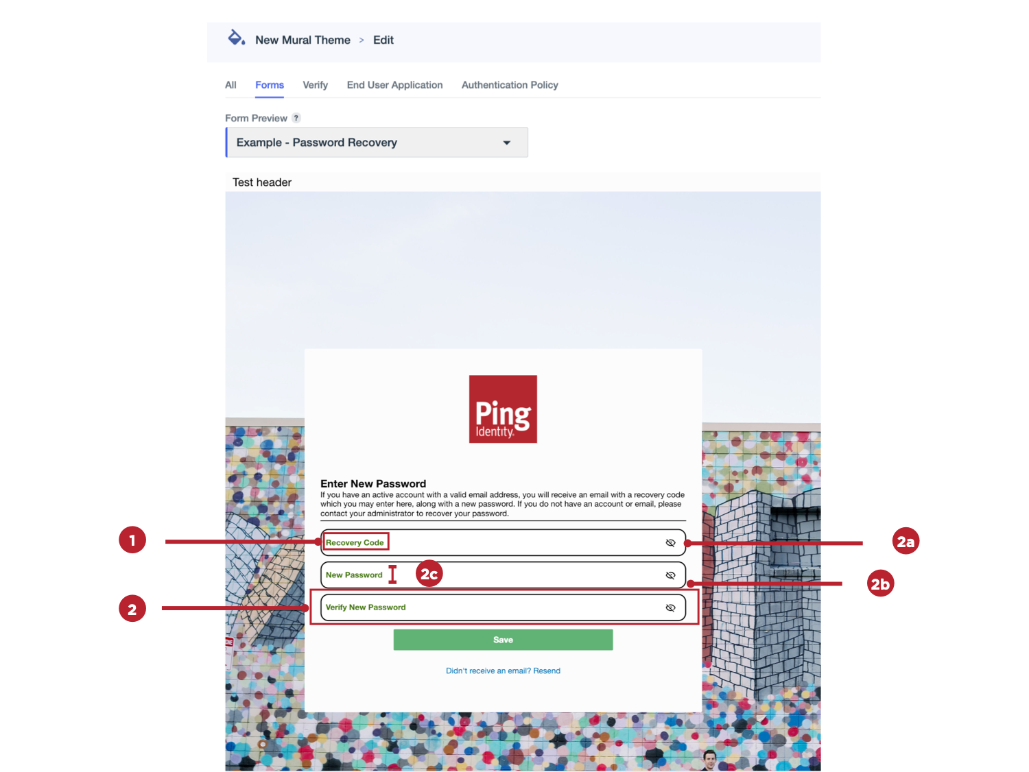
Input Fields
Use these settings to change the appearance of form fields that require user input.
| Setting | Description | ||
|---|---|---|---|
Label (1) |
Select the size, weight, and color of the label text for input fields in your forms.
|
||
Value (1) |
Select the size, weight, and color of the text entered by users in the input fields in your forms.
|
||
Input Box (2) |
Select the border color, border weight, corner radius, and label position for input fields in your forms.
|
Card
Use these settings to change the appearance of the card that contains all of the form elements.

| Setting | Description | ||
|---|---|---|---|
Border (1) |
Select a color for the border around the card that contains all of the form elements. |
||
Border Weight (1) |
Select a setting for the thickness of the borders around the form card. Allowed values range from 0 px (no border) to 4 px. |
||
Corner Radius (2) |
Select a value between 0 (square) and 25 px to configure the curvature of the card corners. |
||
Shadow (3) |
Apply a shadow outline to the card.
|
||
Horizontal Alignment (4) |
Select whether the card should be aligned to the left, right, or center of the form. |
||
Vertical Alignment (5) |
Select whether the card should be aligned to the top, bottom, or center of the form. |
Migrating legacy themes to enable the new settings
The settings described in the previous section aren’t automatically available for themes created before these settings were released. Existing themes include a Legacy label. If you want to enable the new settings for an existing theme, do the following.
Steps
-
In the PingOne admin console, go to User Experience > Branding and Themes and browse or search for the theme you want to update.
-
Click the More options (⋮) icon and select Upgrade Theme.
-
On the confirmation modal, select the I understand and want to continue checkbox, then click Continue.
The new theme settings are now available and the Legacy label is removed.
Cloning existing themes
To test the new settings out on a legacy theme without immediately changing the theme for end users, you can clone a theme and migrate the clone. The cloned theme will have a new theme ID. You can use the clone to test a version of the updated theme in one of your forms to ensure that it’s working as expected. When you’ve validated the changes, you can migrate the original theme, maintaining the theme ID and ensuring that you don’t have to update all of your forms to use a new ID.
To clone a theme, do the following.