API Usage Dashboard
The API Usage Dashboard shows an overview of how your peak API usage is trending against the limits allowed by your license, per rate group. This information can help you decide whether you have sufficient capacity or are approaching the rate entitlements for any of your rate groups.
There are two types of rate groups in PingOne:
-
Buyable groups: You can increase entitlements for these rate groups by purchasing a Maximum Throughput Assurance package. Only buyable rate groups are displayed on the dashboard.
-
Non-buyable groups: These rate groups contain API endpoints with usage that shouldn’t increase with additional end-user activity, such as configuration updates or audit data retrieval. Entitlements for these rate groups are the same for all licenses and can’t be changed. These groups aren’t displayed on the dashboard.
Because usage entitlements are applied at the license level and are measured across all of the environments assigned to the license, the dashboard is at the organization level. You must have the Organization Admin role or a custom role with equivalent permissions to view it.

Rate groups and base-level entitlements
Rate limiting helps Ping ensure that each customer has the share of resources they need at any given time.
The default entitlements provided for each rate group should be sufficient for the majority of customers.
|
In addition to the license-level entitlements, there are environment-level limits that control incoming traffic from single IP addresses. An IP address is limited to 35% of the overall license rate by default. If you have traffic that comes from a limited number of IP addresses or servers, bypass these limits by adding those addresses in Settings > Rate Limits. For Trial licenses, an IP address can use 100% of the overall license rate, but the overall rate cap is lower. Learn more in Configuring rate limits and allowed IPs. |
Maximum Throughput Assurance
For some rate groups, you can purchase a Maximum Throughput Assurance package to increase your peak usage entitlements. For example, you could decide you need additional throughput at peak times because you’ve reviewed the dashboard and anticipate a higher number of simultaneous HTTP requests in the future. Based on the current data displayed in the dashboard, you determine that the increased requests could put you over your current entitlement limits.
Anticipated traffic increases might occur because of something like a popular sporting event, a Black Friday sale, or the start of ticket sales for a large music festival. To prevent users from receiving an interruption in service or a too-many-requests warning during these high-traffic times, contact your Ping representative about Maximum Throughput Assurance packages.
|
To ensure that you have the increased throughput when you need it, consider your organization’s purchasing process and timelines when requesting a Maximum Throughput Assurance package. |
Maximum Throughput Assurance can be purchased for the following rate groups:
| Product | Rate Group |
|---|---|
Authorize |
Authorization API Rate |
Credentials |
Credentials Issuance and Check API Rate |
DaVinci |
Flow Execution (post-start) Rate |
DaVinci |
Flow Progression and Callbacks |
DaVinci |
Flow Start (invocation) Rate |
Directory |
Data Read Rate |
Directory |
Data Write Rate |
MFA |
MFA Polling Rate |
MFA |
MFA API Rate |
Protect |
Protect API Rate |
SSO |
SSO API Rate |
SSO |
Token Check Rate |
Verify |
Verification API Rate |
|
You can find a detailed listing of all rate groups, including their base entitlements and associated endpoints, in Base rate limits in the PingOne API documentation. |
Using the API Usage Dashboard
You must have the Organization Admin role or a custom role with equivalent permissions to view the API Usage Dashboard.
To access the dashboard, click the Ping Identity logo in the PingOne admin console sidebar, click API Usage Dashboard, and then select a license from the list.
The dashboard includes two panels for viewing your API usage data:
-
Historic Peak HTTP Request Rates: Displays your peak API usage for each rate group and how the usage compares against your entitlements in an easy-to-read table format.
-
Daily Peak HTTP Request Rates: Displays your peak API usage, entitlement limits, and 30-day averages for each rate group in line graphs that you can zoom into and analyze to determine when spikes in usage occurred.
Historic Peak HTTP Request Rates table
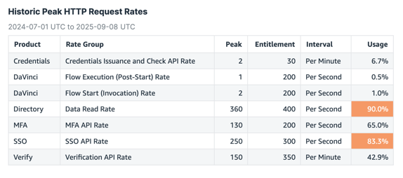
The Historic Peak HTTP Request Rates table on the left side of the page lists the following information about your HTTP requests for different groups of API endpoints over a period of 14 months:
| Column | Description | ||
|---|---|---|---|
Product |
The PingOne services and products included in your license. All Products indicates that these endpoints apply to all areas of PingOne. For example, configuration-related endpoints apply to all products. |
||
Rate Group |
The rate groups that are included under each product. A rate group defines the base rate limits for a particular set of API endpoints. The endpoints are grouped by functionality under each PingOne service or area, and each service or area can have more than one rate group. Each rate group is subject to its own entitlement limit. The rate groups displayed on the dashboard depend on the selected license and the API activity.
For example, if the selected license doesn’t include PingOne Verify, you won’t see Verify rate groups on the dashboard. Similarly, if there’s no activity for the Bulk Data Import rate group during the reporting period, it won’t be listed on the dashboard. |
||
Peak |
The peak HTTP requests reached during the reporting period for the rate group. |
||
Base Limit |
The default number of requests allowed for the rate group. |
||
Entitlement |
The maximum requests allowed by your license for the rate group. This value is the same as the Base Limit unless you’ve purchased a Maximum Throughput Assurance package to increase the entitlement for that group. For example, if the Base Limit for a rate group is 200 requests per second (RPS), and you purchased a Maximum Throughput Assurance package that doubles that entitlement, the Base Limit column still shows 200 RPS, but the Entitlement column shows 400 RPS. |
||
Interval |
The unit of measurement for the rate limit. Some rate groups use RPS, and others use requests per minute (RPM). |
||
Usage |
The percentage of the allowed entitlement that was used when you hit the peak rate limit. For example, if your peak was 250 RPS, and your entitlement is 500 RPS, you used 50% of your entitlement during the peak. If you’re at 80% to 89% of your entitlement, the entry is highlighted in orange. If you’re at or over 90% of your entitlement, the entry is highlighted in red. In both cases, you should investigate further and determine if you need to increase your entitlements.
|
Hover over the upper-right corner of the pane to show icons that you can use to change your view of the table:
-
Maximize the table: Click the Maximize icon (
 ) to hide the Daily Peak HTTP Request Rates graphs and show only the table.
Click the icon again to show the Daily Peak HTTP Request Rates graphs.
-
Resize the columns: Grab a column separator in the table header to make columns wider or narrower.
-
Sort the data: Click the Sort visual icon (
 ) at the upper right corner of the table. Select a column from Sort by and choose Ascending or Descending. Click + Add Sort to add sort criteria and then click Apply.
You can also click a column heading for sort options and to freeze or unfreeze columns.
To export the data to either a CSV file or an Excel file for further review and analysis, click the Menu options icon ( ) and select the applicable option.
Click inside a row in the table to display the Daily Peak HTTP Request Rates graph for a particular rate group in the right pane.
Daily Peak HTTP Request Rates graphs
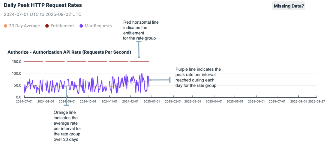
The Daily Peak HTTP Request Rates graphs are based on rate group and include three lines of data:
-
The purple line shows your daily peak usage for the selected rate group.
For each day over a 14-month period, there’s a single data point indicating the busiest second of that day.
-
The red line at the top of the graph indicates the current entitlement for the group. If you’ve purchased increased capacity, this line will be higher than the base rate.
-
The orange line indicates your average peak usage over a 30-day period.
View the 30-day average to see whether your peak usage is an anomaly or if you’re approaching the entitlement limits on a regular basis.
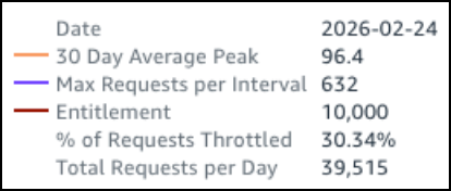
Hover over the graph lines to see detailed data for a particular date, including the total number of requests received and the percentage of those requests that were throttled due to that number exceeding your daily entitlement.
Hover over the upper right corner of the pane to show icons that allow you to perform the following actions:
-
Maximize the Daily Peak HTTP Request Rates panel: Click the Maximize icon (
) to hide the Historic Peak HTTP Request Rates table and expand the Daily Peak HTTP Request Rates panel.Click the icon again to minimize the panel.
-
Click the Filter icon to see the filters that are applied to the graph.
-
Click the Menu options icon (
) to:-
View summary data: Display the data in a table format.
-
Export to CSV: Export the data to a CSV file for further review and analysis.
-